Boxes, Within Boxes, Within Boxes, Within Boxes#
For proper layout on the web, we first need to understand how CSS sizes elements—and then how we can add space between them.
This is called the the box model, as everything on the web begins as a rectangle.
Beyond the basic color and type properties from last week, understanding and using the box-model is how we start to bring our designs to life. While there are more advanced techniques (that we’ll get to later), these fundamentals are still used in every site on the web.
-
Introduction to CSS Layout – MDN
As usual! -
Layout – web.dev
This gets intogridflex; -
Learn CSS Layout
An old-but-still-good run-through.
…use the effectiveness of the former “background” quite deliberately, and consider the blank white spaces on the paper as formal elements just as much as the areas of black type.
box-sizing#
box-sizingBy default, all browsers’ user-agent styles have an unfortunate defaultbox-sizing: content-box;paddingborder )inline-size /widthblock-size /heightpaddingborder )
box-sizing
We’ll usually flip the default for this!
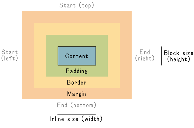
With box-sizing: content-box;
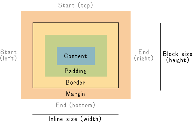
With box-sizing: border-box;
This is often unintuitive for designers and doesn’t fit with most web design patterns—so it is very, very common (nearly universal) to instead override this to box-sizing: border-box;paddingborderpaddingborder )
W3C might have got this default wrong. Good ol’ CSS!
What’s in The Box?#
Let’s take a look at this box, going inside-to-outside.
Content#
The content area is the guts of the element, usually text or an image. Its dimensions are usually defined by the intrinsic size of that content, but also can be specified directly via widthheightinline-sizeblock-size .
Introduction to the CSS box model - MDN
Going inside-to-outside, the very inside.
Be sure to look at the HTML here! It’s a similar structure throughout.
Padding#
Next comes paddingbox-sizingborder-box ,
Padding – MDN
There will be many of these links!
A Sidebar About Shorthand#
Know that paddingbordermargin—
Shorthand Properties – MDN
Be wary of the siren call of shorthands!
| 1 value: | All Directions/sides |
| 2 values: | top/bottomleft/right |
| 3 values: | topleft/rightbottom |
| 4 values: | toprightbottomleft |
						section { padding: 1rem; }
section { padding: 1rem 2rem; }
section { padding: 1rem 2rem 4rem; }
section { padding: 1rem 2rem 4rem 2rem; }
These three- and four-value rules are often harder to read and quickly understand though, so we tend to avoid them. You can always write the individual directions out, for clarity! (And cleaner diffs, with separate/whole-line changes.)
						section {
	padding-top: 1rem;
	padding-bottom: 4rem;
	padding-right: 2rem;
	padding-left: 2rem;
}
…and Logical Properties#
You can also now define all your box model properties using logical directions—meaning instead of physical top /bottom ,left /right )block-start /block-end ,inline-start /inline-end )
CSS Logical Properties
Adrian Roselli has a very thorough explanation.
In horizontal, left-to-right writing modes (as in English):
						/* These physical directions: */
padding-top: 1rem;
padding-right: 1rem;
padding-bottom: 1rem;
padding-left: 1rem;


/* Also these physical sizes: */
height: 20rem;
width: 20rem;
						/* Map to these logical directions: */
padding-block-start: 1rem;
padding-inline-end: 1rem;
padding-block-end: 1rem;
padding-inline-start: 1rem;

/* And these shorthand for both: */
padding-block: 1rem;
padding-inline: 1rem;

/* Become these logical sizes: */
block-size: 20rem;
inline-size: 20rem;
This startendflexboxgrid ,
This allows your design/styles to behave in a logically (if not physically) consistent way across languages with varied writing modes and different text directions. You can write styles that work even when your site is translated! (And the two-direction shorthand is nice, here.)
Border#
Back to our box model, moving outwards, with borderborder-color ,border-width :
Border – MDN
Our first non-text design element! You are allowed.
The shorthand border-block-start
Different border-style#
border-styleThere are also various border-styledotted-color-width :
border-style
Some of these are good; some of these are bad.
Look at all those borders.
Rounded Corners with border-radius#
border-radiusIt’s much more common these days to see the border-radius
border-radius
“Sand down” your sharp edges.
Margin#
The last part of our box is marginpaddingborder ,
Margin – MDN
The space between things.
This is away to suggest a multi-column feeling while keeping your reading flow clear.
Negative Margin?#
Margin has a couple tricks up its sleeve. First, it can have negative values—which will eat up/cinch/remove space between elements—where paddingborder
Are negative CSS margins bad practice? – dev.to
Some example uses. “It depends!”
The first element pulls the second element closer with a negative margin.
Margin Collapse?#
Also margin
Mastering margin collapsing – MDN
Brilliant or annoying!
You might expect the margin between the first two section12rem ,8rem !
CSS Lengths#
Okay, so now we have all these box properties—but how do we specify the dimensions? CSS has many length units, used for inline-size ,block-size ,padding ,border ,margin ,font-size .
<length>
Length is used by many properties!
Absolute Units#
Maybe the easiest ones to understand, these are fixed to physical (well… sort of) sizes.
In general, we try and avoid these in modern development as they are necessarily brittle. Remember: the web is not a “physical” medium!
With the many vagaries of screen size and density, the physical/ruler lengths will only be correct when you print. And maybe not even then!
You’re saying “exactly this size.”
						/* An old/outdated length measurement. */
.pixels {
	block-size: 360px;
	inline-size: 720px;
}

/* These only make sense in print! */
.inches {
	block-size: 5in;
	inline-size: 10in;
}

.mm {
	block-size: 84mm;
	inline-size: 400mm;
}

.pt {
	block-size: 12pt;
	inline-size: 72pt;
}
Relative Units#
Most of the time we want to use relative
These are based on our layout, viewport, or typography dimensions! And are much more resilient because of this systematic/relationship-based approach.
These are distinctly and intrinsically web measurements.
You’re saying “in relation to this other size.”
						/* Relative to nearest “sized” ancestor. */
.percentage {
	block-size: 90%;
	inline-size: 75%;
}

/* Relative to viewport height/width. */
.viewport {
	block-size: 75vh;
	inline-size: 80vw;
}

/* Relative to `:root`/`html` font-size. */
/* These define our typographic systems! */
.rem {
	block-size: 12rem;
	inline-size: 2.4rem;
}

/* These are relative to an element’s font-size. */
/* `1em` is “one line.” */
.em { block-size: 14em; }

/* The cap height. */
.cap { block-size: 1cap; }

/* Roughly one letter width. */
.ch { inline-size: 1ch; }

/* The x-height. */
.ex { block-size: 1ex; }

/* A line-height (baseline to baseline). */
.lh { block-size: 1lh; }

/* These all have `:root`-relative versions too: */
/* `rch` `rcap` `rex` `rlh` */
Combined via calc()#
calc()Extending the idea of systematic/relationship-based dimensions, often you will want to use different units together! Mixing types or otherwise doing some maths, to express your design intent. For this we have the calc()
You’re saying “calculate the size from these others.”
						.flexible-and-fixed {
	inline-size: calc(50% - 2rem);
}

.computer-do-the-math {
	inline-size: calc(100% / 12);
}
Constrained by min- /max-#
min- /max- .constrained-inline {
min-inline-size: 12rem;
inline-size: 50%;
max-inline-size: 24rem;
}
.constrained-block {
min-block-size: 6rem;
block-size: 100%;
max-block-size: 12rem;
}
/* Handy to watch your line lengths! */
p {
max-inline-size: 65ch; /* 65ish letters. */
}
Defined as --variable#
--variableCustom properties (folks almost always say CSS variables) aren’t strictly units, per se—but they’re used in conjunction with them. They allow you to codify the relationships in your design!
CSS Custom Properties Guide – CSS Tricks
Web guru Chris Coyier’s robust overview.
These bring another programming concept of variables into CSS. These are shorthand entities for any values (not just lengths) we want to reuse throughout a document.
Changing the value of a variable changes it everywhere it is referenced—no copy/pasting or find/replacing. You could think of a color swatch, if you are in an Adobe mindset; other tech folks call these tokens. Again, these are just for you—it is all the same to the computer. More ergonomics!
In your CSS, you declare (set) these with a --var() .
You’re saying “these things are meant to be the same.”
						/* Special “entire document” selector, akin to `html`. */
:root {
	/* Declare them: */
	--brand-color: #e42a1d;
	--base-spacing: 2rem;
}

main {
	/* Reference them: */
	color: var(--brand-color);
	padding: var(--base-spacing);

	/* Or build from them: */
	margin-block: calc(2 * var(--base-spacing));
}
The convention is to declare “global” variables on :rootstyle.css
CSS is big and massive and overwhelming and sometimes indefensibly nonsensical—but remember that you can do a surprising amount with just these basic properties!
And no matter how complex it gets, it really always comes back to these basics.
Positioning#
With an idea of how elements take up space, now we’ll look at how they exist and move together in the document flow. The CSS property position
Position – MDN
Interesting web work often uses position .
Static#
By default, every element is static
You’ll rarely, if ever, actually set this yourself—it’s the default!
Nothing changes herestatic
Relative#
The first thing we might want to do is adjust an element from that normal staticrelative
Once you have set position: relative;inset-block-start ,inset-inline-end ,inset-block-end ,inset-inline-start
Note the space—the element still exists/takes up space in the flow.
Absolute#
absoluterelative
So absolutestatic—
Importantly, position: absolute;
This is often used for exacting, specific design element placement. But it is inherently brittle!
The element is out of the flow, and placed according to the relative
Fixed#
fixed
So position: fixed;
This is often used for things like navigation elements.
Try doing this in print.
Sticky#
The most recent addition to the position party, position: sticky;static ,
This is often used for headers on tables and lists.
You’ll hear Michael say this a lot: this always feels very web-y.
“Depth” with z-index#
z-indexOkay, z-indexpositionz-index
-
z-index
This can be tricky to work with!
By default, items that are lower in the HTML (coming after each other) are in front of higher, earlier elements:
The two positionz-index: 1;
A whole lot of things make a new stacking context (including most position
-
The stacking context – MDN
Each of these is a stacking “group.”
No amount of internal z-indexz-index
Display#
In our HTML introduction we briefly talked about blockinlinedisplay
Display – MDN
Our blockinlinegridflex )
Block#
As we discussed, many HTML elements are block-level by default. But you can also set display: block;inlineblock-size ,inline-size ,margin
Whenever you are linking a whole area (like an image and text together), safe bet that you want block .
Inline#
And then going the other way, you can force block elements to be inline with display: inline; .block-sizeinline-size-block-start /-block-end )
The white-spacepre
But Also inline-block#
inline-blockYou can also combine the qualities of blockinlinedisplay: inline-block; .block-sizeinline-sizemargin )
Keep in mind these will have a space between them, like they are words!
And Sometimes none#
noneSetting display: none;
This is a common way to hide/show (by setting another display
Poof. Like it wasn’t even there.
…vs. Visibility?#
You can also hide something visually without taking it out of the document flow, which is useful when you don’t want the page to jump/reflow when something appears/disappears.
Visibility – MDN
This also hides elements from assistive technologies (screen readers).
Setting visibility: hidden;visible
…vs. Opacity?#
Another way to hide an element visually is to adjust opacity ,010%100% .visibility
Opacity – MDN
The entire element and its descendents are adjusted, as one.
You can still select the text (or click links) of not-fully-opaque elements.
Keep in mind that display: none; ,visibility: hidden; ,opacity: 0;
What About Floats?#
Oh right, floats. Sometimes you’ll want to have an image or block flow within a block of text. There are a lot of ways to do this now, but the oldest (and sometimes still the trickiest) is a float
Floats – MDN
You don’t see these used as much anymore!
Left and Right#
The declarations float: inline-start;float: inline-end;
Any text siblings will then flow around the element—like a text wrap—filling up any available space to its side. They will go as far up as the top of the floated element:
Don’t Forget to clear#
clearSince this takes the floated element out of the flow, if we want the following element (often another text block, like a <p> )clear: inline-start;clear: inline-end; ,clear: both; .
Applied on the following element, it will make it stay entirely below (clear of) the floated element:
Uh oh, classic float
If you have a parent wrapper and no following element, there won’t be anything there to clear the float—meaning the parent will collapse down to the size of the text content. Almost never what you want.
You can solve this broken look with a clearfix hack, which uses a pseudo-element as an ersatz last-child
Much better. :afterdiv .
What about flex and grid?#
We’ll cover these next unit! They’ll make your (layout) life easier. But again, you’ll always be using the box-model concepts here.
					E.g.:
____________

 H1 has a 1 character left margin

 So does H2

      P starts here and could
      go on forever. Wow, a 5
      character left margin
      sure looks great!
       _____
      | + + | Wow, you can do
      |  @  | images as well?
      | --- | Then you'll
      |_____| want a 1 character
      margin on the left side.
      Until, you're below the
      image that is.
_____________

This is where we the simple stacked
box model is a bit too simple.