First Again, Why Is This Important?#
Beyond just “making it look good,” what does learning CSS do for us? What can we take away from it? Many things will be in common with HTML—but what else?
Why should a designer care about CSS?
-
You’ll be working with a developer who (probably) does not !
-
The patterns of CSS—relationships, rules, types, classes, exceptions—are useful models/tools for any design work, even non-digital things.
-
In particular, its “large to small” specificity/cascade paradigm helps structure robust, resilient design thinking.
-
Unpacking our design intuition in code makes us better at understanding and then verbalizing our rationale, IRL.
-
It offers many novel forms of expression, which can broaden our aesthetic horizons.
-
Within one language, we can tackle (international) typesetting, (all kinds of software) interaction, and (even) motion.
-
It is flexible, powerful, and evolving ! Gets better every day.
CSS stands for Cascading Style Sheets#
CSS is the standard language/format for styling web pages, which specifies what the page’s HTML will look like in the browser.
-
CSS – MDN
MDN, as is custom. -
Basics of CSS
Another ASMR introduction from Laurel. -
Google’s web.dev CSS Course
Different order from ours, but pretty good. -
HTML Color Codes
Too many ads, but some nice tools for color. -
Google Fonts
We’ll use this for free font families. -
Wakamai Fondue
“What can my font do?”
In our ongoing analogy, CSS is the skin of the web. Just like HTML, at its most basic it is still just text, in a file, on a computer. It can live inside HTML documents themselves, but is more commonly seen on its own with the extension .css
CSS came after HTML, first proposed by Håkon Wium Lie in 1994—who was working with our friend Tim at CERN and wanted more control over the presentation of web pages. (Tim was against the idea, thinking it should be up to each user—he lost.) It’s had three major revisions that have grown the vocabulary:
- CSS 1, 1996
- CSS 2, 1998
- CSS 3, 1999
For the past decade or so, features have been added incrementally by browsers “within” the CSS 3 “standard” (as it was/is with HTML). That’s how it goes, these days.
The change in relationship between generator and consumer of information is going to take some getting used to.
…I’ll comment that style sheets constitute a wormhole into unspeakable universes. People start thinking they’ll just set up a little file […] and soon it grows uncontrollable.
Where CSS Lives#
Before we get into the CSS syntax itself, let’s talk about how it is incorporated with your HTML.
There are three four ways CSS can be added to your page:
- Inline on individual HTML tags themselves
- In-HTML blocks via
<style> - External, separate
.css<link> - External (layered) using
@import/layer()
1. Inline with style=#
style=This is the original and most straightforward way to add styles, directly as attributes in HTML tags:
<p style="color: red;">This text will be red!</p>
Seems obvious. However this has some big downsides—imagine you want to style all of your paragraphs in the same way, and with multiple properties:
						<p style="color: red; font-family: sans-serif;">This text will be red!</p>
<p style="color: red; font-family: sans-serif;">I’d also like this to be red.</p>
<p style="color: red; font-family: sans-serif;">And they are all sans-serif, too.</p>
<p style="color: red; font-family: sans-serif;">Awful lot of repetition, here.</p>
<p style="color: red; font-family: sans-serif;">You get the idea, this is bad.</p>
It makes it hard to read, and hard to change and maintain—you’d have to update every single instance. (In software, we’d refer to this as brittle—meaning it is easy to break.)
2. In-HTML with <style>#
<style>The next way that was added to the standard was using a special HTML element, <style> ,<head>
The rules are written written with selectors—more on those, below. But importantly, we can now control styling of all the paragraphs easily, at once.
						<!doctype html>
<html>
	<head>
		<title>Page title</title>
		<style>
			p {
				color: red;
				font-family: sans-serif;
			}
		</style>
	</head>
	<body>
		<p>This is a paragraph.</p>
		<p>This is another paragraph.</p>
		<p>This is third paragraph.</p>
		<p>They would all be red!</p>
	</body>
</html>
3. External with <link>#
<link>Things are getting much better, allowing us to style whole pages easily and consistently. But what about when we have multiple pages?
If you wanted a whole site to use the same styles, you’d have to duplicate the <style><link>
						<!-- `index.html` -->
<!doctype html>
<html>
	<head>
		<title>Page title</title>
		<link href="style.css" rel="stylesheet">
	</head>
	<body>
		<p>This is a paragraph.</p>
		<p>This is another paragraph.</p>
		<p>This is third paragraph.</p>
		<p>It would still be red!</p>
	</body>
</html>
And then in a separate style.css<style>
This will apply to any page that we add the <link>
						/* `style.css` */
p {
	color: red;
	font-family: sans-serif;
}
4. External with @importlayer()#
@importlayer()We’ll talk more about specificity later, but as your projects grow you’ll often want to organize your styles further to avoid “collisions” of multiple applied styles.
CSS more recently added cascade layers to help manage this. These are most easily used in a <style>@importlayer()
Each lower/subsequent layer takes precedent over the previous—no matter the selectors/specificity inside!
						<!doctype html>
<html>
	<head>
		<title>Page title</title>
		<style>
			@import 'reset.css' layer(reset);
			@import 'base.css' layer(base);
			@import 'page.css' layer(page);
		</style>
	</head>
	<body>
		<p>…your complicated project!</p>
	</body>
</html>
We’ll touch on specificity below, but keep in mind that inline styles takes over all other methods—under the “closest, then lowest” logic. It’s another reason why we avoid it! And why layer()
Separation of Concerns#
Separation of Concerns is an ideology that code should be split up into sections that are responsible for a single behavior—the smaller, the better. In the case of websites—our HTML, CSS, and JS map to the different behaviors of content, form, and function. (Or in our anatomical analogy: skeleton, skin, and muscles.) These are different concerns.
-
Separation of Concerns - Wikipedia
Divide your big problems into smaller ones!
It’s much easier to understand how it all comes together if you keep the code for these three behaviors in separate files. Your IDE will be easier to use; your diffs more sensical; you’ll know where to start looking to figure something out.
CSS Rules#
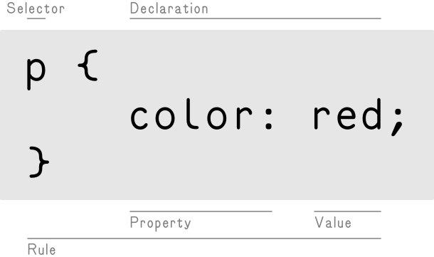
Even though it is used to style HTML elements, the syntax of CSS is very different. CSS rules are made up of selectors—used to target certain elements—and then the declarations that you want to apply to them. For this thing, do this!
-
CSS Syntax – MDN
They really need to update their diagrams. -
CSS Reference – MDN
Their exhaustive list goes into the hundreds.
The curly brackets { }
Properties are always separated from their corresponding values by a colon : ,; .2rem )
Ergonomics#
Just like HTML, CSS usually does not care about capitalization, extra white space, or line breaks. Folks generally use tabs/indenting to indicate hierarchy, but again it is just whatever makes it easier for you!
Capitalization does matter when using #id.classes
Like with HTML, it’s easiest just to be consistent and stick to lowercase (and no spaces)!
						p {
	color: red;
	font-family: 'Geneva', sans-serif;
}

/* Is the same as… */

P{COLOR:RED;FONT-FAMILY:'GENEVA',SANS-SERIF;}
Know that there are many, many, many CSS properties. We’ll go over some in our exercises, but look through these to become more familiar.
Basic Selectors#
CSS selectors are used to target certain HTML elements within the page. These can get pretty complicated, but we’ll look at the three simplest and most common targeting methods to start:
-
Type, Class, and ID Selectors – MDN
MDN again, as we do. -
Selectors – web.dev
Google, too.
- Elements like
pamain - Classes via
.class-name - Identifiers with
#some-id
1. Element Type: pamain ,#
pamain ,If you want to change the styles for all instances of a given HTML element, you drop the < >
-
Type selectors – MDN
Match by node name.
Note that CSS has different /* comment syntax */
2. A Class: .class-name#
.class-nameBut maybe you don’t want to style all of the paragraphs. You can then use a .class
-
Class selectors – MDN
Specify/match things that are alike.
Be sure to flip between the HTML and CSS!
The value here is our class name, which we write in CSS by prefixing with a ..highlight.faded .
And individual elements can have multiple classes, too. Class names are usually qualitative/descriptive but can be whatever you want—there are whole methodologies about what to call these things! (And many an argument.) They are the one of the most common way to target things in CSS, especially at scale.
We’ll talk about how conflicting rules are handled, below!
3. An Identifier: #some-id#
#some-idYou can also use an #id ,
-
ID selectors – MDN
Specify/match singular elements.
These are prefixed by ##title/#introductionid="title"/id="introduction"
If you remember, identifiers can also be used as link destinations! Which do keep the #
Fancy Selectors#
Compound and lists: selector.selectorselector, selector#
selector.selectorselector, selectorYou can use compound/combinations of the above elements, classes, and identifiers to be even more specific—however, this can likely mean you just need to rethink your HTML structure. (We’ll unpack specificity, below.)
-
Compound selector – MDN
Combine simple selectors to be more specific. -
Selector list – MDN
This, that, the other.
More commonly, you might apply declarations to multiple selectors, sometimes called group selectors, with a
Be thinking about how these might help organize your stylesheets as “design systems.” But maybe you actually want a .class
Specific Attributes: selector[attribute]#
selector[attribute]You can use various other HTML attributes as selectors too, using square brackets [ ]
-
Attribute selectors – MDN
Select with other non-.class,#id
Pseudo-Classes: selector:stateselector:instance#
selector:stateselector:instanceStates / Instances#
These are special selectors, added to element ,.class ,#id ,: ,
-
Pseudo-classes – MDN
Select elements in a particular state.
Note that :hover
Counts / Positions#
Other common pseudo-class examples have to do with counts and positions. The syntax for these can be pretty complicated, but they are very powerful—for targeting specific children, often as within lists:
-
CSS
:nth-child
A tool to make these more intelligible. -
Quantity Queries – CSS Tip
Another for selecting the container.
Many designs treat the first or last (top or bottom) instances differently—this is a way to select them without needing a .class .
Negation / :not#
:notThere is also a special :not
-
:not()
Invert/negate the selector(s) inside the().
It’s pretty easy to over-select with :not
It can be tricky and confusing to use, though—so consider flipping your mental model, instead of the logic! Selectors are already hard enough.
Pseudo-Elements: selector::pseudo#
selector::pseudoSlightly different are the various pseudo-elements, which let you style a particular part of an element. You’ll most often see these as ::before::after ,::first-letter::first-line
-
Pseudo-elements – MDN
Not quite elements!
Note the difference in :::::first-letter /::first-line .
And Combinators: >+~#
>+~Last, you will often want to target something based on its relationship to other elements in HTML—its siblings or its parents. For this, CSS has combinators, which let you relate all the various selectors we’ve learned about here together:
-
CSS combinators – MDN
Based on HTML relationships.
These can get tricky, but also let you express some specific design intent!
Importantly, combinators can only target elements top-down, meaning that it can only “see” elements before and above themselves—meaning their previous (older?) siblings or their parents. This directionality somewhat corresponds with the cascade, which we’ll talk about shortly.
The Golden Age of CSS#
CSS is a living standard, and new features are shipping in browsers all the time—often making our (front-end) lives easier. Here are a few:
:has()#
:has()For many, many years folks have wanted a “parent selector” in CSS—meaning a way to apply a style to a parent/container based on one of its children or siblings. This has not been possible before, as mentioned above.
-
:has()
This can completely transform and simplify style systems!
CSS has finally added the :has()
section:has(p) { background-color: red; }
“All section
section:has(+ ul) { background-color: gold; }
“All sectionul
Importantly, the property is applied on the parent (here, the section ):has()
All CSS expresses rules, but think about :has()
Simpler :is():where()#
:is():where()There are also the recent :is():where()
-
Meet
:is():where()
Simpler grouping of styles.
This kind of mess:
						main > h2, main > h3, main > h4,
aside > h2, aside > h3, aside > h4 {
	color: tomato;
}
Can become this:
						:is(main, aside) > :is(h2, h3, h4) {
	color: tomato;
}
Also :where()
Sometimes adding .classes:is() /:where()
Remember, code is going to be read more often than written ! Make it easier to understand.
Also, (Native) Nesting?!#
While we’re on the subject of more cutting-edge additions to CSS—even more recently browsers have added support for nesting selectors—a way to easily “scope” them hierarchically, even more intuitively/flexibly than :is() /:where() .
-
Using CSS nesting – MDN
Simplify and make your style relationships more evident!
This more straightforward style of writing descendent/child selectors was popularized by the ubiquitous SASS extension—which improved the ergonomics of CSS ahead of the language incorporating new features.
Instead of writing like this:
						header,
footer { color: blue; }

header .any-descendent,
footer .any-descendent { color: teal; }

header > .direct-child,
footer > .direct-child { color: aqua; }

header + .right-after,
footer + .right-after { color: gray; }

header ~ .following,
footer ~ .following { color: lime; }

header.with-class,
footer.with-class { color: cyan; }

header:hover,
footer:hover { color: navy; }

header::before,
footer::before { content: 'Nesting?'; }

.parent header,
.parent footer { color: plum; }
You can write like this:
						header,
footer {
	color: blue;

	.any-descendent { color: teal; }

	> .direct-child { color: aqua; }

	+ .right-after { color: gray; }

	~ .following { color: lime; }

	&.with-class { color: cyan; }

	&:hover { color: navy; }

	&::before { content: 'Nesting!'; }

	.parent & { color: plum; }
}
Note the &
…to make the actual/HTML hierarchical relationship self-evident, less redundant, and easier to change—especially as your stylesheets inevitably grow! Each level (generation?) can be any CSS selector.
These all can dramatically improve your editing experience! Write your styles to match your design intent—the reasoning, in code.
Pitfalls, Gotchas, Frustrations#
CSS has a lot of these—where you will find yourself asking “where is this style coming from?!” But it’s often one of these:
Specificity#
We can’t talk about CSS without talking about specificity—bane of many a front-end developer. This is one way of determining what style will be applied, when there are multiple/conflicting rules.
-
Specifics on CSS Specificity – CSS Tricks
A brief overview of a very complicated thing. -
Specificity Calculator
Compare selector values and see who wins.
The first three targeting methods element ,.class ,#id )#id
Said another way: identifiers are thus more specific than classes, which are more specific than element selectors. (And you shouldn’t really use them, but inline styles beat them all.) Take this example:
The specificity “decides” what style is applied here.
You could write a long book (and many people have) about CSS specificity—the myriad of ways that some CSS rules take precedent over others. It is often one the more frustrating parts (especially when working with legacy code that is poorly considered).
Oh Right, the Cascade#
Yikes, we haven’t even talked about that first C ! Remember, it stands for cascading—the other way of deciding what gets applied.
-
Introducing the CSS Cascade – MDN
MDN is pretty dry on this one. -
The CSS Cascade
A much nicer interactive explanation from Amelia Wattenberger.
This means that when there is a tie of the same specificity (like two .class<link>
Move the .warning.note
And Inheritance#
To add some even more confusion, some CSS properties set on a parent also apply to their children—such as colorfont-familysizemargin
Inheritance – web.dev
Google is better on this one.
Inheritance allows you to quickly set some properties globally, without having many brittle/redundant rules, as we did before—often the fastest way to approach your design:
All the children inherit the bodysans-serif .
Avoiding These “Problems”#
It is easiest—both in visuals, and in code—to think about your design reasoning, rules, and relationships from “large to small” (or “broad to narrow,” or “general to specific”). Decide first on what is always true, then move to subsets, and finally any one-offs.
In CSS, this manifests as styling element.class#id
						body {
	/* Things that are true of everything! */
}

main {
	/* Then moving to smaller pieces… */
}

header {
	/* …going down your page. */

	p {
		/* Maybe with some “scoped” nesting. */
	}
}

.featured {
	/* Then into more granular groups of things… */
}

.warning {
	/* …that you manually specify in your HTML. */

	p {
		/* These might also have some nesting relationships. */
	}
}

#navigation {
	/* Last, _maybe_ a couple one-offs! */
}
We think this methodology will help both your design thinking and your CSS implementation!
Color and Type Properties#
Alright, so all this has been about targeting elements—what about actually styling them? Let’s introduce a few quick properties to get us started:
Color#
Besides the basic examples above, color can be specified in a handful of different ways. What works best for you will depend on your project (and mindset); here are some of the approaches:
CSS Colors – MDN
Come for the picker, stay for all the info.
Note the :nth-childtomato
Named colors are quick to work with when you know a few, but hslacolor-mix
These can also all be applied to background-colorborder ,
Fonts#
Remember, the web is text all the way down ! Much of your design vocabulary will come from your type and its decisions—especially when starting out. Everything you work on will start here.
Fundamental Text and Font Styling – MDN
All your properties.
So most importantly for us, you’ll always be customizing your typography—starting with the font-family
With great power comes great responsibility!
Web font licensing is a Whole Big Thing—so we’ll start out by making use of Google Fonts (though you can use another free option), which offers many open-source typefaces nicely packaged for web use. You can select families and weights there to easily include in your pages, as in the example above.
-
Google Fonts
Easy to start with!
Other Type Properties#
Once you’ve got a font-family
Web Typography –
Interneting Is Hard
A more qualitative take.
For now, just eyeball your units in rem ,
Resets#
As we talked about last week, browsers have their own, built-in way that they display HTML elements. These
This is the “look” we have been seeing when we write plain HTML without any CSS—usually Times New Roman, with blue links, and small spacing between elements.
Often, when you are working towards your own design, you will find yourself working against these built-in styles. So many designers/front-end folk instead start with resets—a semi-standard collection of CSS rules that “zero out” the browser’s built-in look for a “clean slate.”
This means you have to write everything yourself, but you have more control and aren’t building on unknown foundations. And things should be (more) consistent, across browsers and platforms.
This is the clean base we’ll be working from! Here is a simple, modern reset for your <head> :
<link href="https://typography-interaction-2627.github.io/assets/reset.css" rel="stylesheet">
This is what we use here for our course site!
The author of HTML documents has no influence over the presentation. Indeed, if conflicts arise the user should have the last word, but one should also allow the author to attach style hints.
…The last point has especially been a source of much frustration among professions that are used to being in control of paper-based publishing. This proposal tries to soften the tension between the author and the reader.