Browsers Are Our Imperfect Venue#
There is no single best browser; they are all kind of differently bad, in different ways.
-
Chrome DevTools
We’ll be using these. -
Safari Web Development Tools
Got some long-overdue love way back in Sonoma, but little since then. -
Firefox DevTools User Docs
Spiritual successor to Firebug, the first suite.
Many developers use Chrome for its popularity/hegemony, before testing in other browsers. It also arguably has the most robust set of DevTools—though Safari and Firefox have their own versions, too. Much of this is just preference, but ultimately you’ll want to see what your visitors are seeing.
You have always been able to
You’ll often hear people (Michael) call it the Web Inspector, or just The Inspector. It’s going to be your best (Web) friend, showing you everything that the browser has parsed to display your pages.
Inspecting Pages#
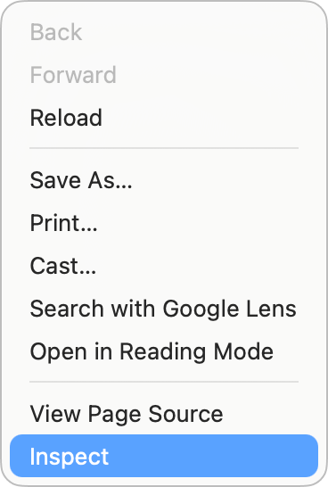
In Chrome, you can bring them up by right-clicking on any element/part of a page and clicking
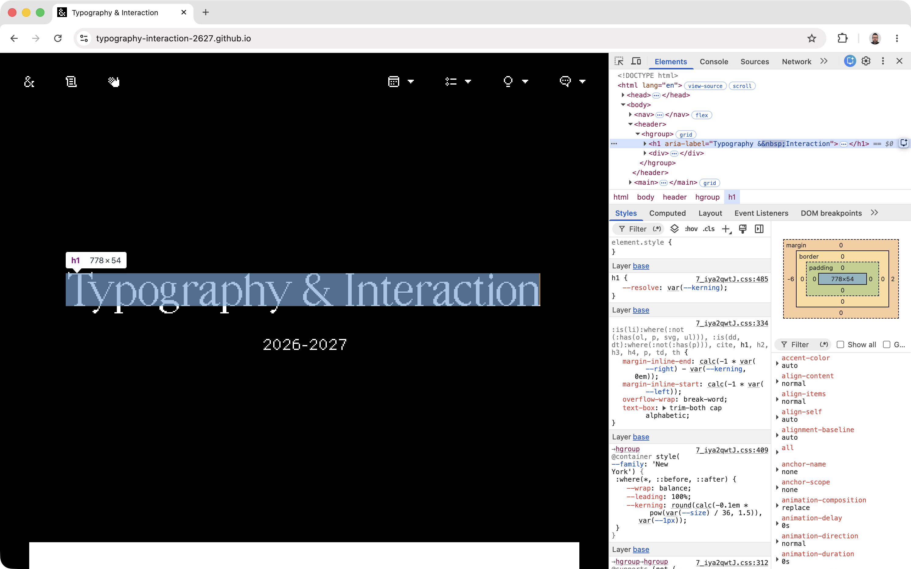
By default, you’ll see the tools open on the right side of the page. Depending on how big your screen is, they might be laid out a bit differently—but the basics are usually the same:
You can also hit
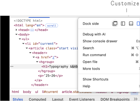
The Customize
Elements Panel#
The top part of the tools is the DOM—you can expand/collapse all the nested HTML elements on the opened page.
The first
The second
The
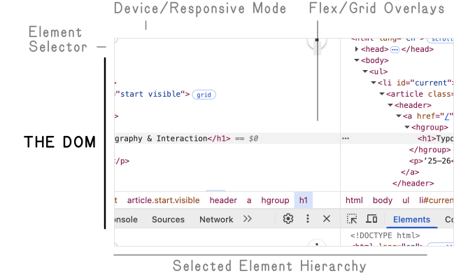
Handy tip:
Styles Tab#
The area below is for the styles. It shows whatever CSS properties apply to the element you have selected above, in the DOM/Elements panel.
These are ordered (somewhat unintuitively) in a more-specific, reverse-cascade sequence—inline styles at the top, external and internal stylesheets, then user-agent styles at the bottom—with any cascading/conflicting rules crossed out, as you go down.
On the right, you can see the sum Computed (or rendered) values of all the rules that apply—regardless of where they come from. These represent exactly what the browser is showing to you for the selected element.
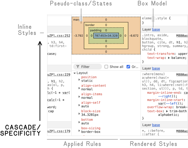
You can type specific CSS properties/values into both
You can make changes in Elements or Styles, and the edits will be immediately visible on the page as if you had edited the source files!
It’s useful to try things out quickly—and diagnose where problems/conflicts arise.
Device Mode#
Enter device mode with the little phone/laptop
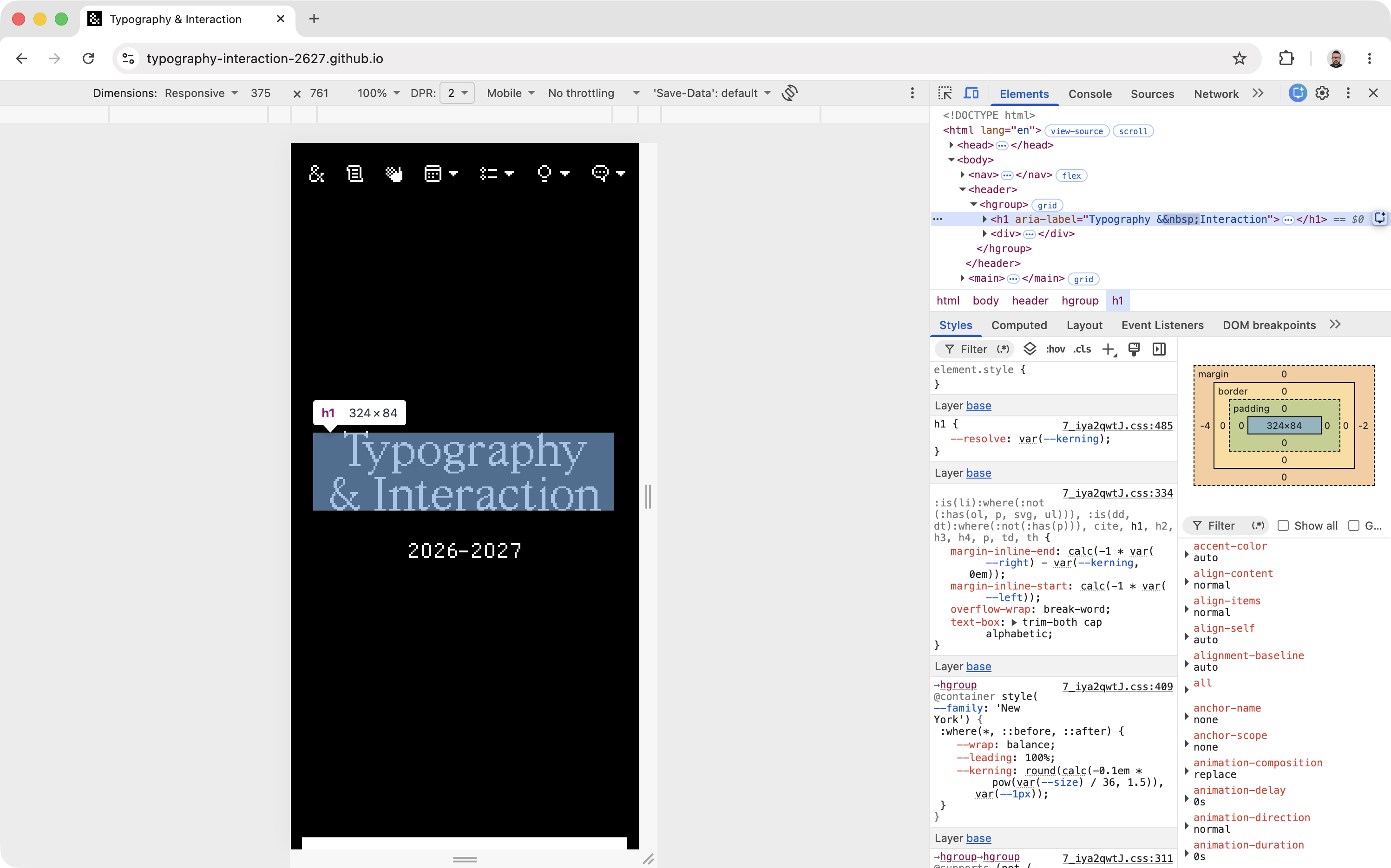
Be sure to hard-refresh with

Generally, use the
The Preview Zoom also allows you to approximate views larger than your current screen! You can specify larger dimensions, and it will scale down to show the entire viewport. This is great for developing on a laptop—it won’t be precise, but it’ll give you some idea of big screens.
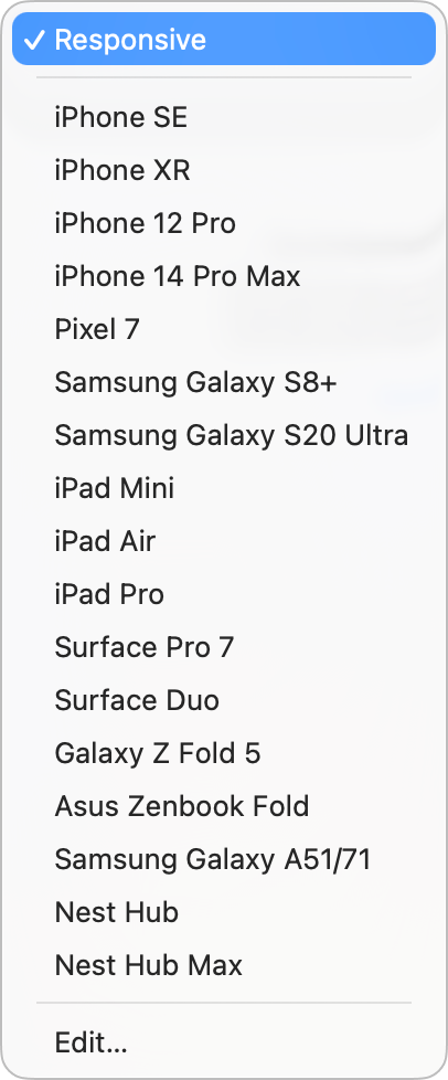
The
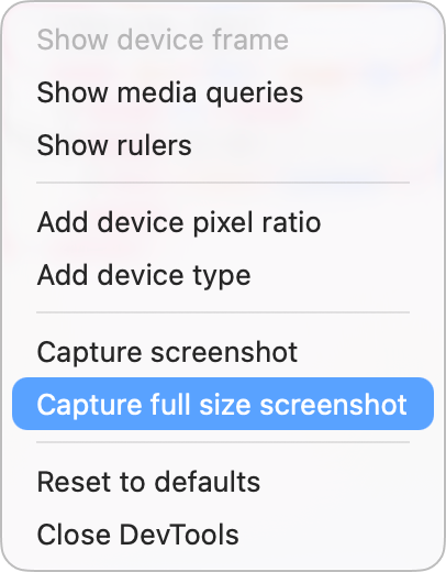
The
Remember that you are not targeting specific devices; you are looking for when your design/content breaks!
The Console#
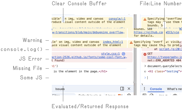
The console is used to help you work with JavaScript, by logging messages, warnings, and any errors from your code as it runs. It can also evaluate written/pasted JS, live.
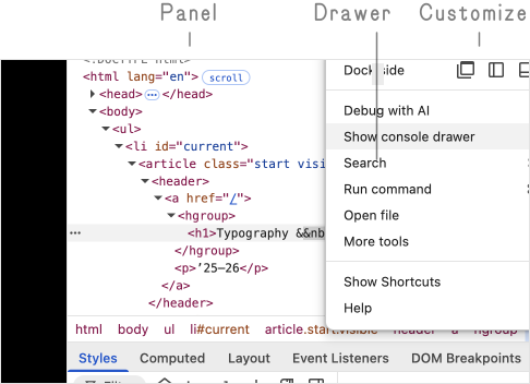
If your tools are already open, you can show the
You can also hit
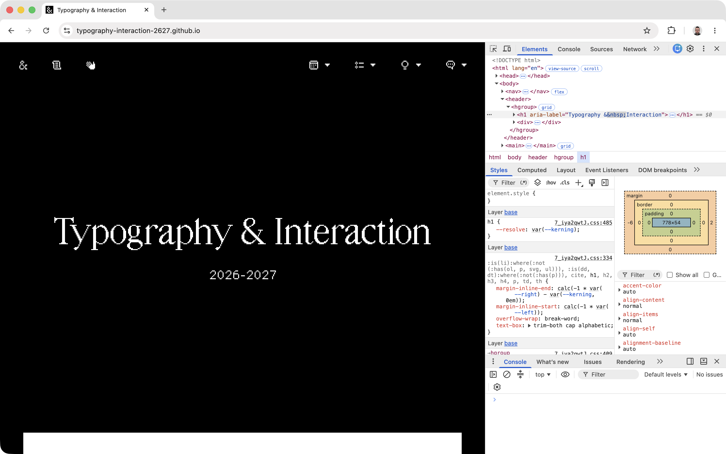
The Console opened under Elements/Styles.
This area will show any messages logged from your JavaScript with console.log() .
Warnings and errors (like missing files, or bad JS syntax) will also be shown here—usually with clickable
You can also evaluate and try your JavaScript here directly, by typing (with some nice auto-completion) into the bottom of the console—like console.log('Hello, world!')
You can use this to test out parts of your code right away, like document.querySelector('h1') .